 "georgechristensen" (georgechristensen)
01/03/2016 at 04:56 • Filed to: None
 0
0
 3
3
 "georgechristensen" (georgechristensen)
01/03/2016 at 04:56 • Filed to: None |  0 0
|  3 3 |
This is blatantly copying For Canada’s post but with Australian plates instead of Canuckistani ones.
9. New South Wales
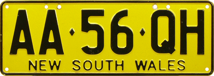
Do I even need to say anything? Just look at it.
8. VIC Education State/QLD Smart State

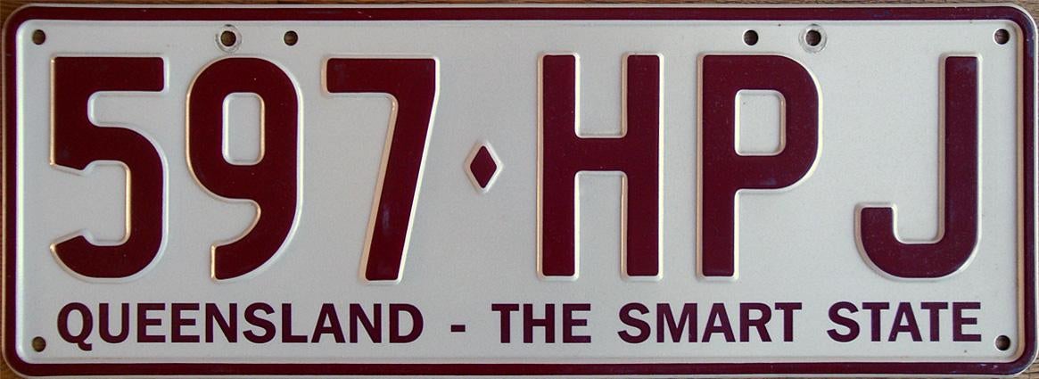
These are in the same spot not because of their design but instead what they say. The following gif is my reaction towards these.

7. South Australia
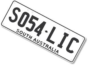
Not bad, just incredibly boring.
6. Australian Capital Territory.
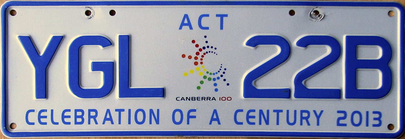
It’s blue (Da ba dee).
5. Northern Territory
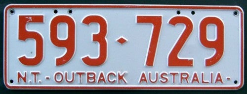
Unlike other plates it’s all numbers and is the same colour as the NT soil.
4. Queensland
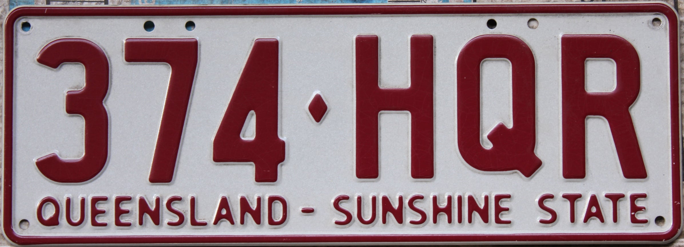
Clean, same colour as their State of Origin team.
3. Victoria.
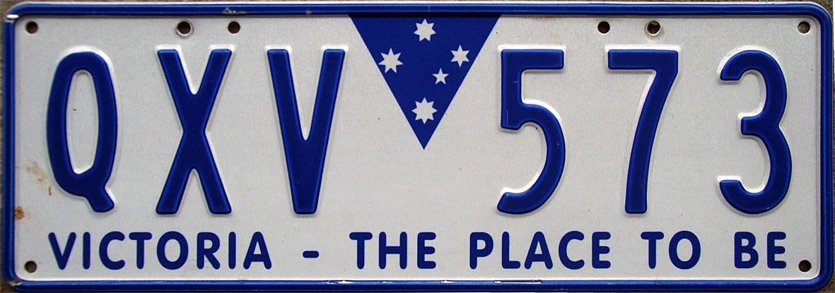
It has a blue triangle with a Southern Cross on it.
2. Western Australia
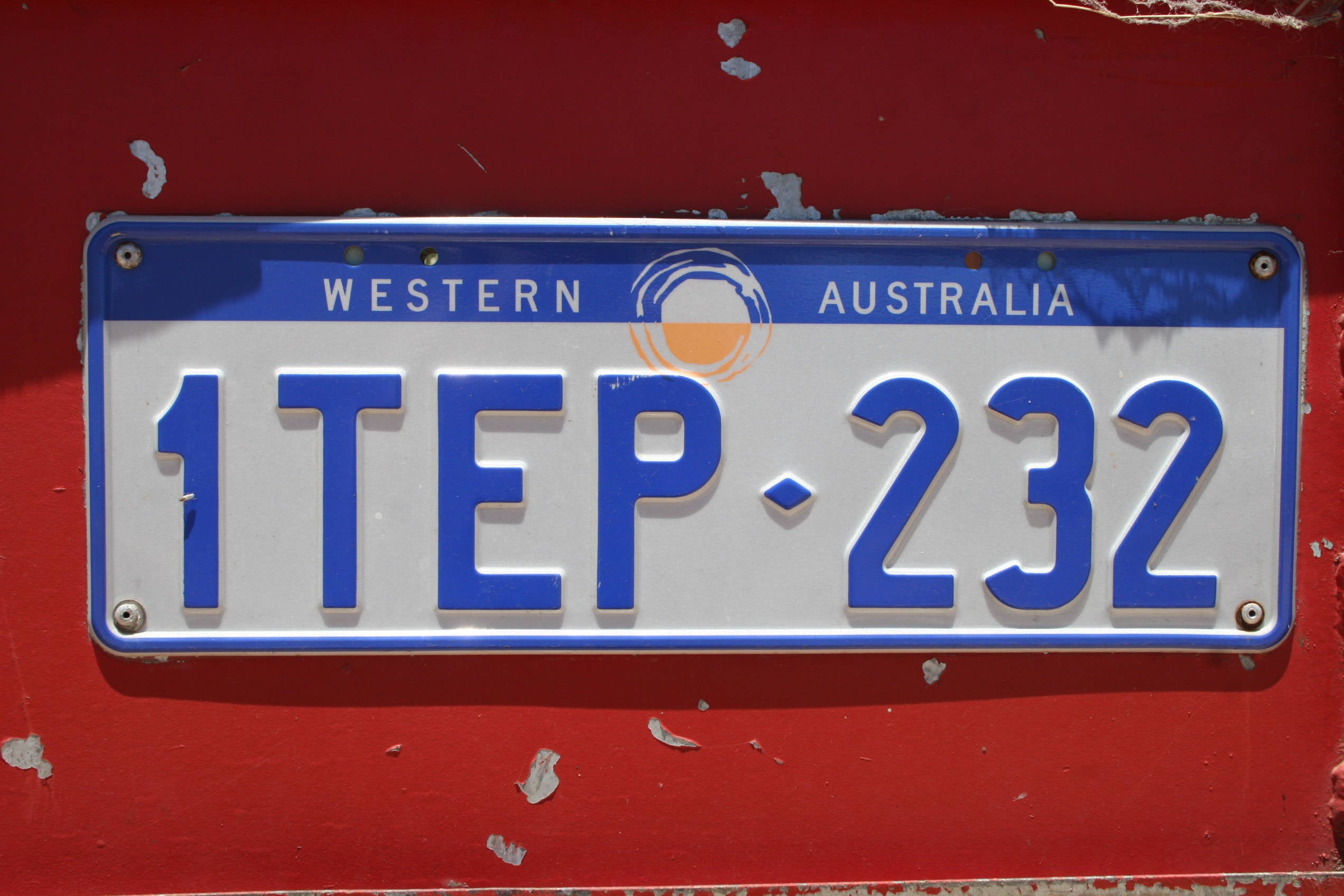
I like the sun in the middle.
1. Tasmania
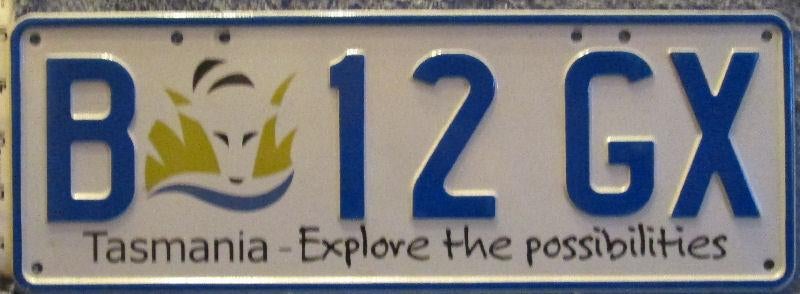
This is #1 because it’s the only one that isn’t cripplingly boring and has some artistic flair too it.
If you thought Canadian plates were boring they’ve got nothing on these.
 pip bip - choose Corrour
> georgechristensen
01/03/2016 at 05:20 |
|
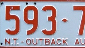
you know the old joke - Q. why do NT number plates only have numbers?
A. ‘cause Aborigines can’t read.
 pip bip - choose Corrour
> georgechristensen
01/03/2016 at 05:28 |
|
Vic plates are getting better though.

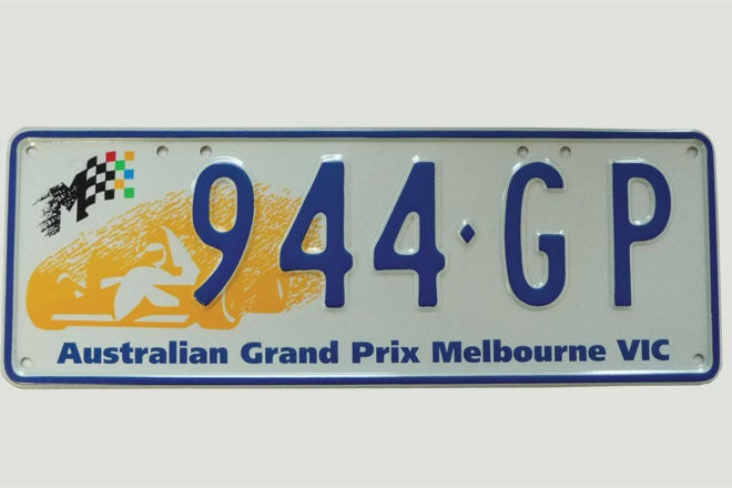
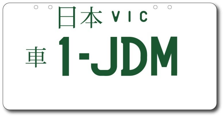
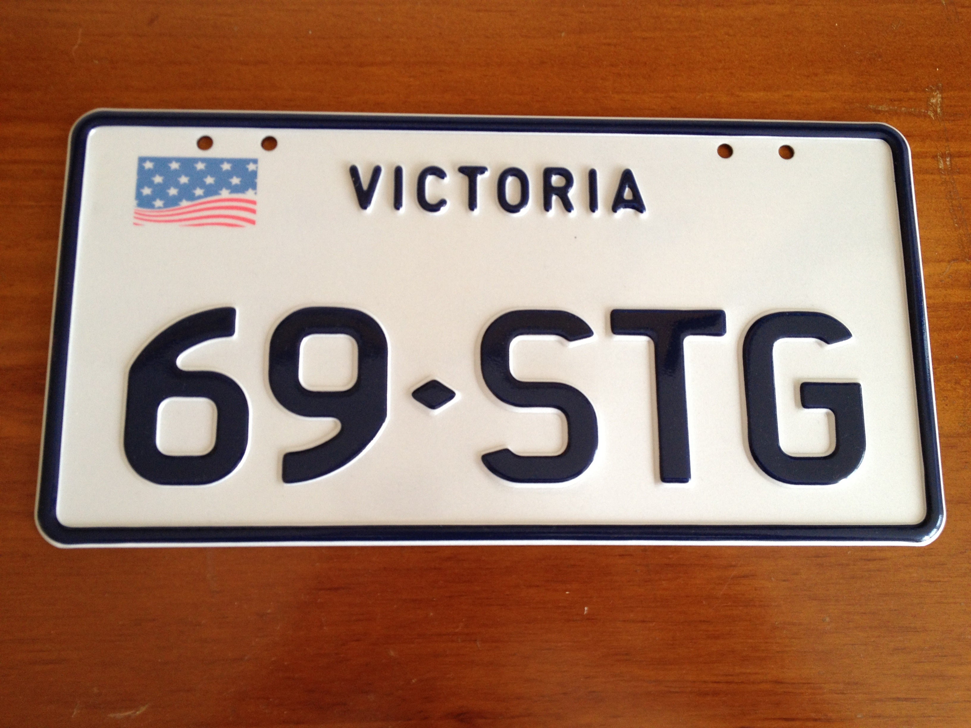
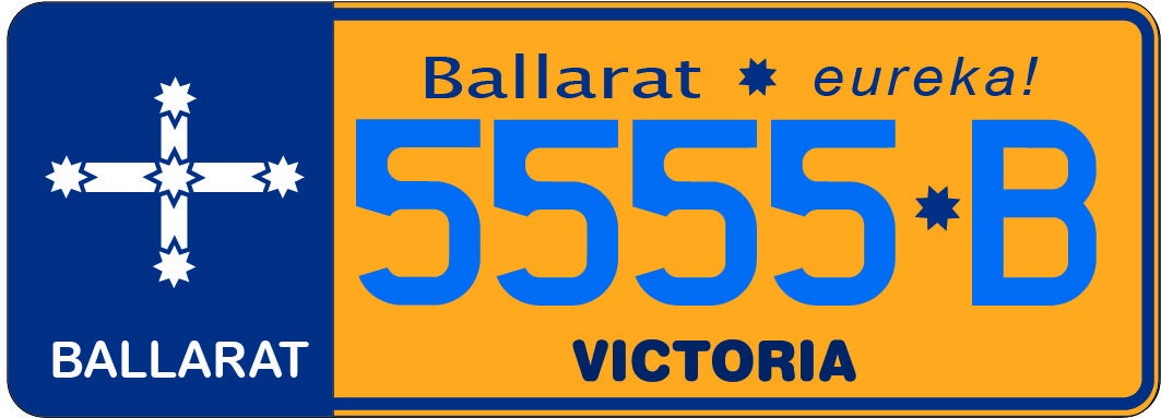
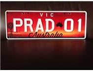

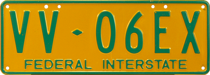
plus you didn’t mention Federal Interstate plates.
 Rainbow
> georgechristensen
01/03/2016 at 06:35 |
|
People complain about American money being boring, and it is, but we have the best license plates in the world. Nobody seems to remember that part.